Bishop's Diagonal: A Dance of Color and Harmony
Client: Dazzle Jazz
This collection showcases a vibrant depiction of the jazz scene for the month, capturing the essence of live performances like a well-executed opening gambit. Flowing musical notes and abstract instruments swirl around the various acts, creating a sense of movement akin to pieces in a dynamic chess match. The rich, deep blue background evokes the intimate ambiance of a jazz club, setting the stage for an engaging experience reminiscent of a carefully prepared chessboard.
Bold, contrasting colors and fluid lines reflect the energy and spontaneity of jazz, inviting viewers to immerse themselves in the rhythm and soul of the performances as if they were navigating through a complex middlegame. This design collection is not just an announcement; it’s a strategic call to action, encouraging audiences to engage with the artistry and passion that define the jazz experience.
Each design element serves as a calculated move in this visual game, promising an unforgettable evening of music and creativity. The arrangement of performers and visual motifs mirrors the intricate positioning of chess pieces, with headliners standing out like powerful queens and supporting acts flanking them like agile knights. The overall composition maintains a delicate balance, much like a tense endgame, where every note and visual cue contributes to a harmonious yet exhilarating visual checkmate.
Strategic Symbols: Illuminating Faith
Client - North Lake Church
This icon set for North Lake Church beautifully encapsulates the essence of the church’s mission and community. Each icon is meticulously designed, featuring clean lines and a harmonious color palette that reflects the church’s welcoming and serene environment. The icons represent various aspects of church life, including worship, community, and service, offering a visual language that is both meaningful and accessible.
Queen's Rise: Sweet March Celebrations
Client: Dazzle Jazz
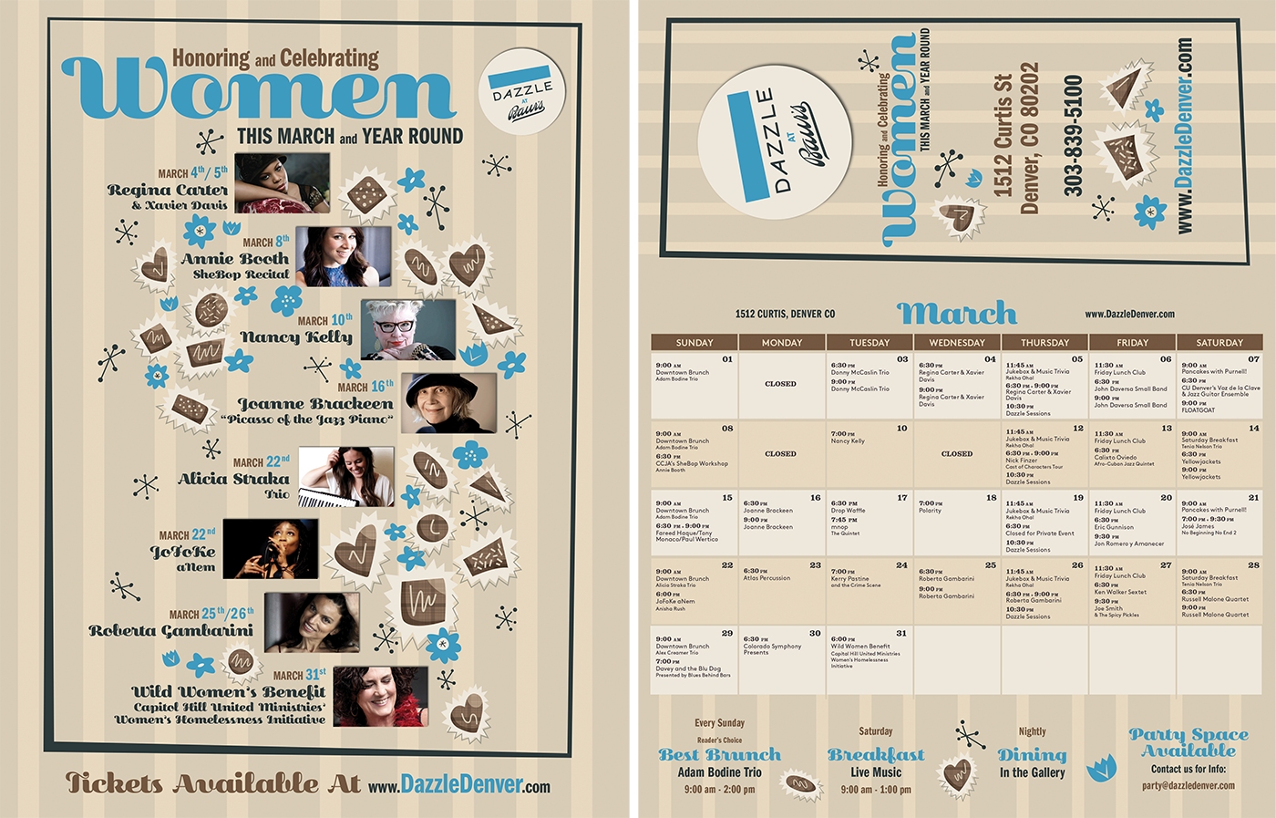
The design collection for the women’s acts featured in March showcases a warm tan background adorned with dynamic stripes, setting the stage for a vibrant celebration across multiple visual pieces. Abstractly drawn chocolates are scattered throughout the designs, each piece positioned like pawns on a chessboard, complemented by whimsical floral elements and other abstract motifs.
The contrasting text in blue, brown, and black boldly commands attention across the various designs, much like well-placed knights ready to strike. This composition invites the viewer to indulge in the sweetness of the performances, while the playful arrangement of elements creates a sense of movement and excitement throughout the collection.
In this visual strategy, the design series not only highlights the talent of the featured artists but also serves as a delightful invitation to experience the artistry and empowerment of women in the spotlight. Each element across the collection is a calculated move in the game of creativity, promising an engaging and memorable event. The cohesive yet varied designs work together like a well-coordinated chess strategy, each piece supporting the others to create a powerful and enticing visual experience.


