Pased Pawn: Nourishing Creativity
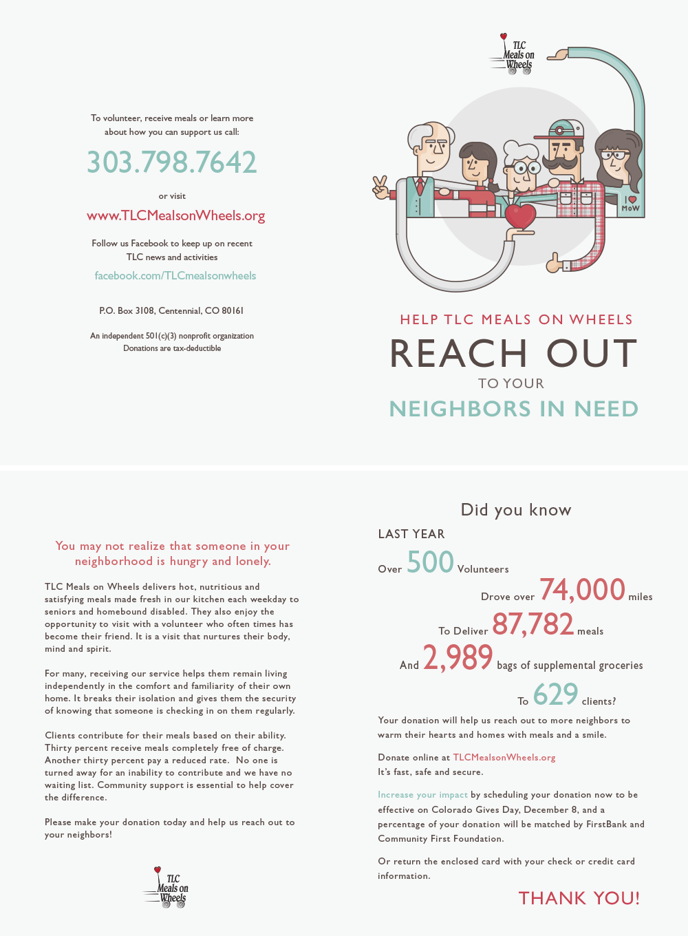
Client: Meals on Wheels
From 2013 onwards, I had the privilege of serving as the graphic designer for Nourish Meals on Wheels, a collaboration that spanned several rewarding years. This partnership was akin to a well-played chess opening, setting the stage for a strategic and impactful visual campaign.
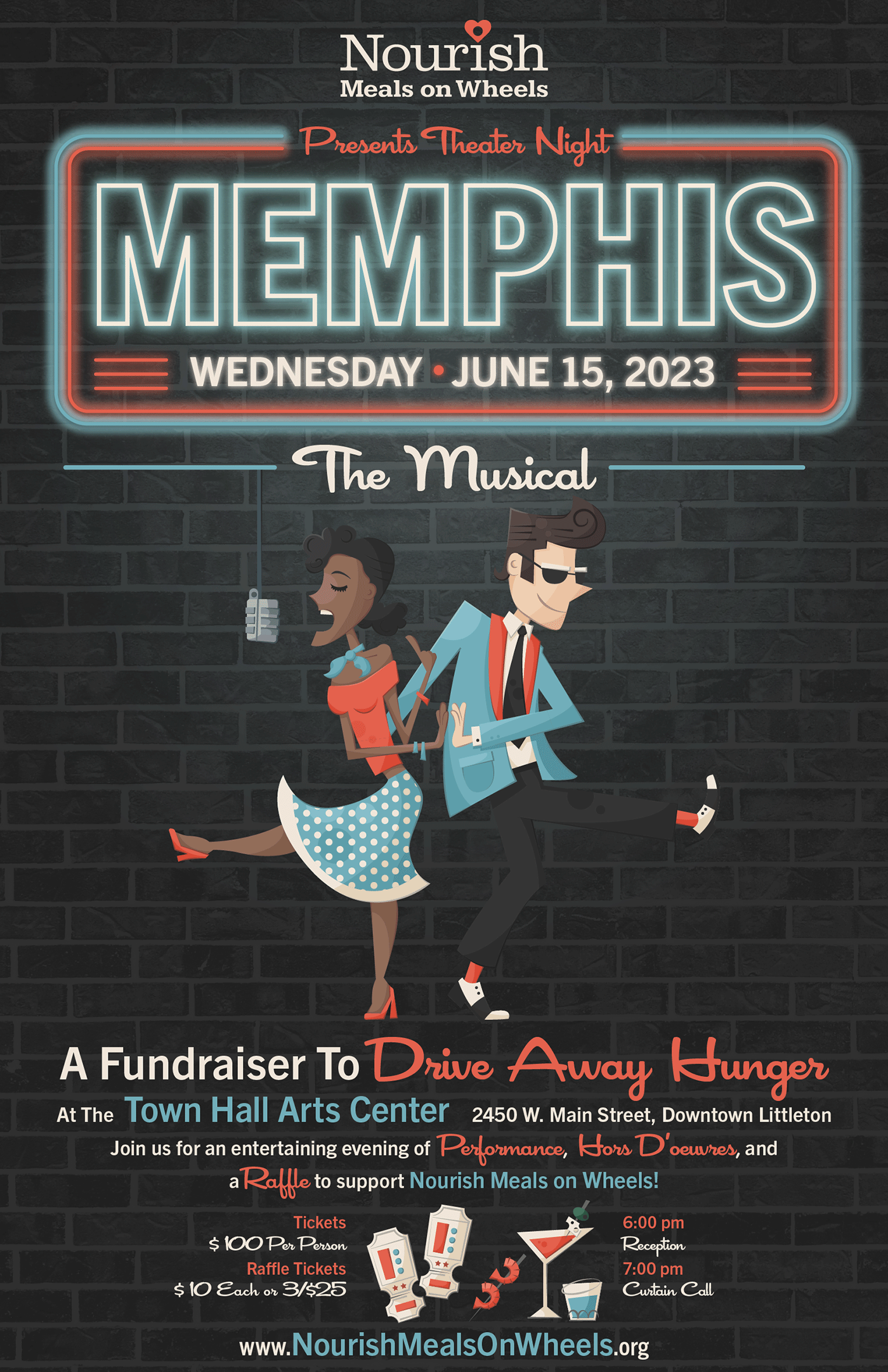
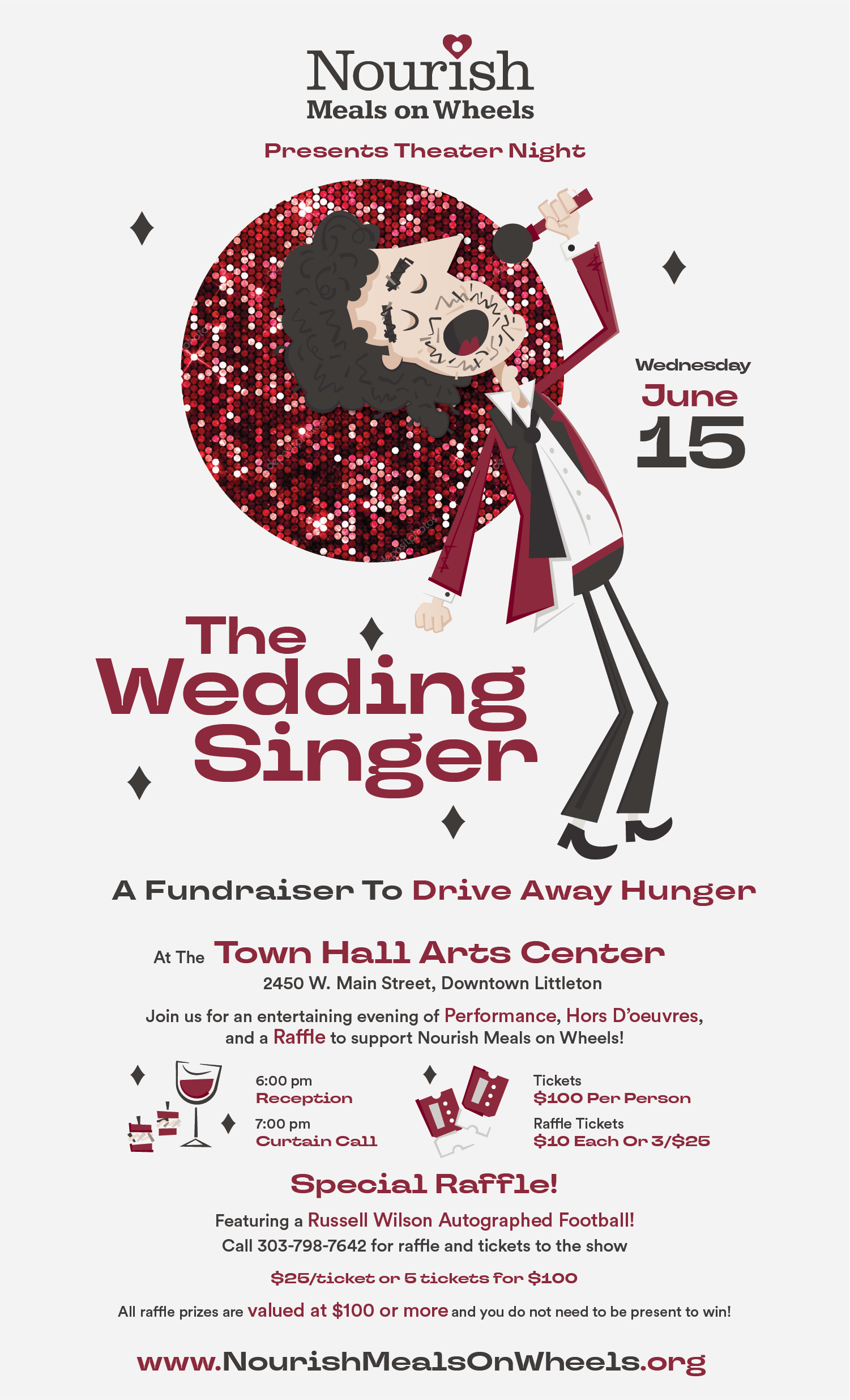
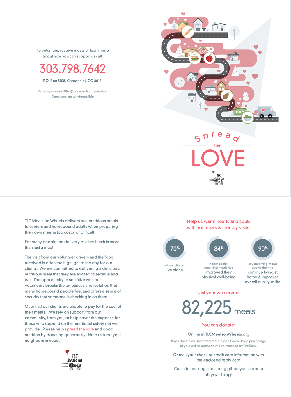
My creative palette was put to vibrant use as I crafted an array of visual delights for their annual theater night – from eye-catching posters and inviting invitations to sleek programs and scroll-stopping social media content. Each piece was carefully positioned, much like a chess player would place their pieces on the board, to maximize impact and engagement.
Working with Nourish was truly a feast for the imagination, blending the art of visual storytelling with the heart of community service. The process often felt like an intricate chess game, where each design element was a carefully considered move, working in harmony to create a cohesive and compelling visual narrative.
As the years progressed, our collaborative efforts evolved, much like a chess game entering its middle game. We refined our strategies, learned from past campaigns, and continually innovated to keep our visual messaging fresh and engaging. The annual theater night became our grand tournament, where all our creative pieces came together in a spectacular display.
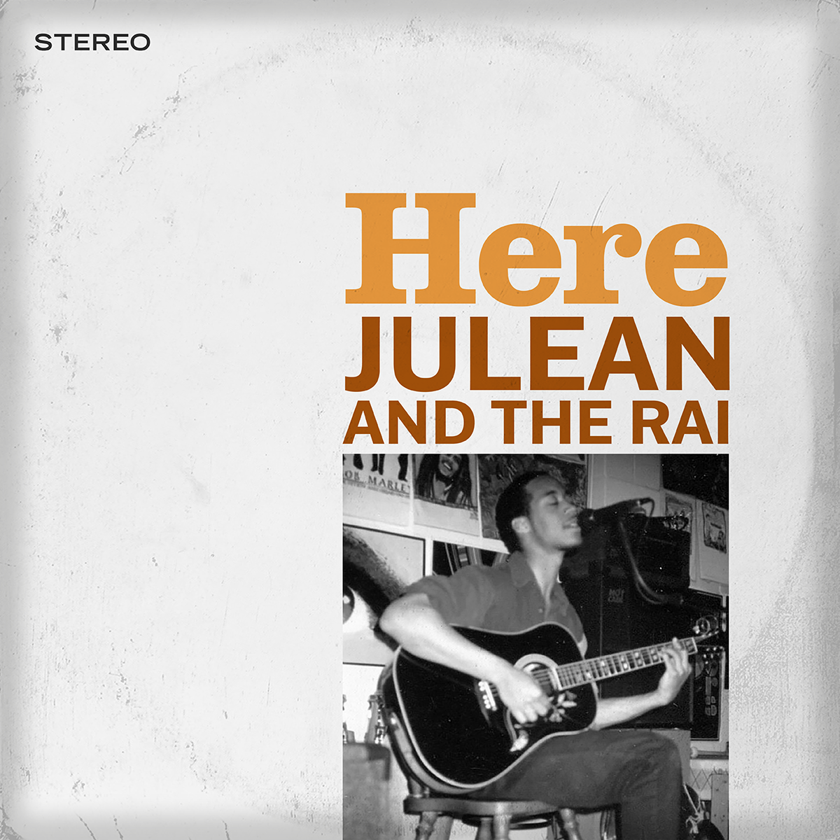
Vertical Line: Album Cover Designs
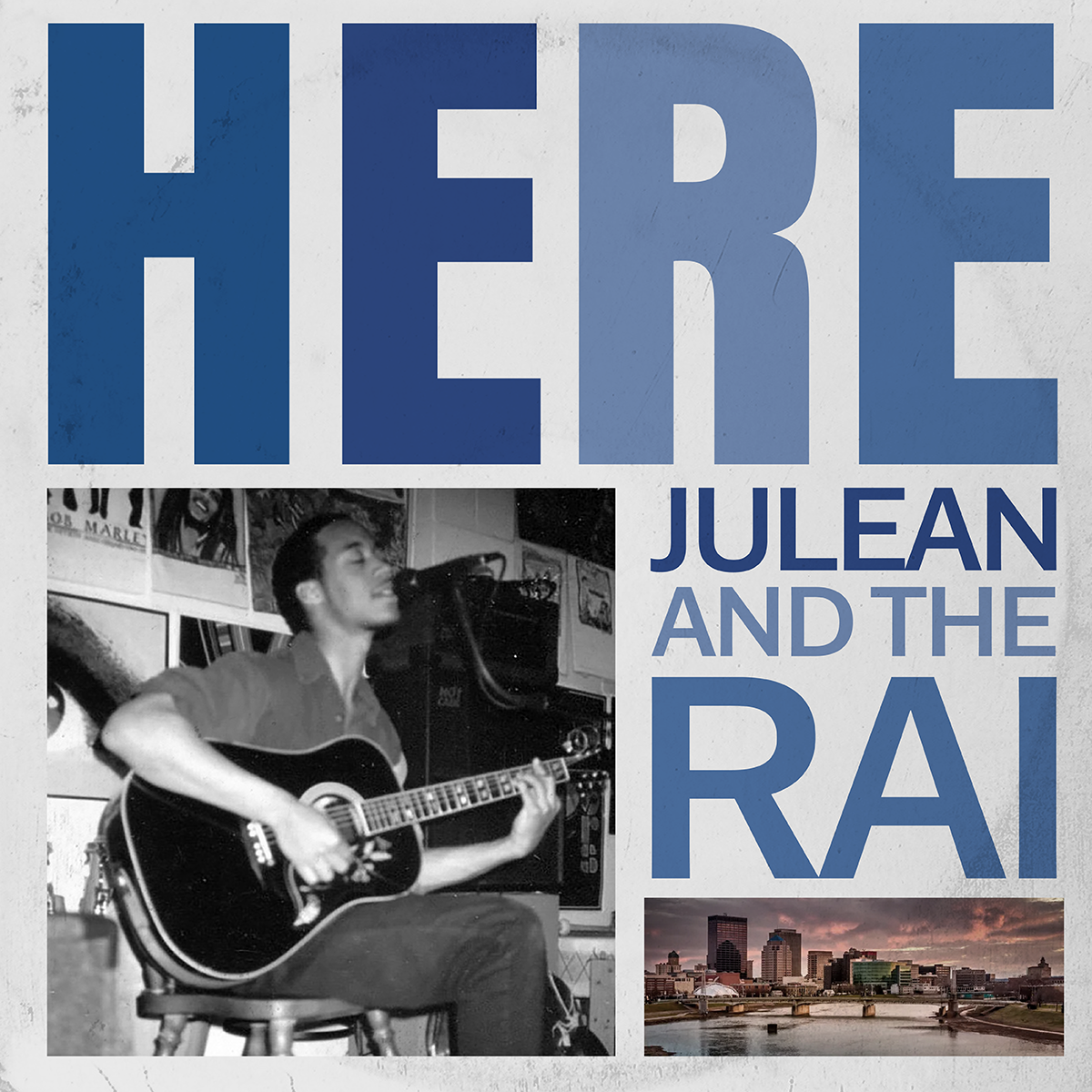
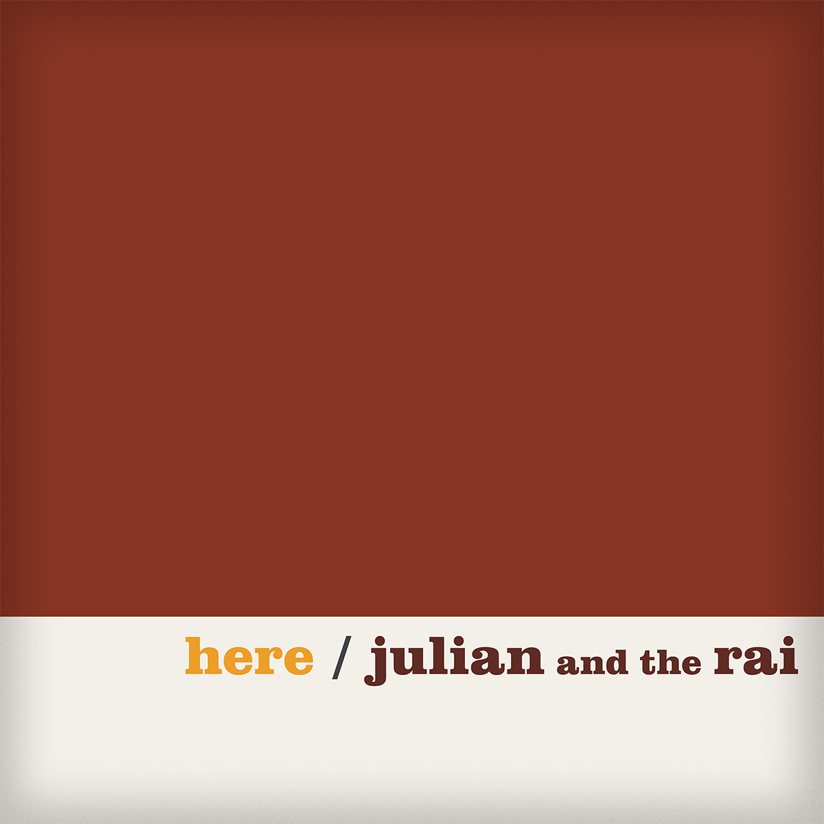
I met this musician during an Uber ride, where our conversation flowed like a well-played chess match. He asked me for some album covers, and I created minimal yet beautiful designs that portray him as a brilliant, smartly-dressed, and delightfully idiosyncratic figure in the Colorado music scene.
Unpinning: A Palette of Possibilities
Client: Meals on Wheels
This captivating image serves as a powerful opening gambit in the visual storytelling of “The Wedding Singer,” encapsulating the essence of the musical with a modern twist. The composition brilliantly combines vibrant colors and dynamic elements, creating a lively visual landscape that mirrors the energetic spirit of the story. The central character, much like a queen on the chessboard, dominates the scene with charm and charisma, drawing the viewer’s eye and establishing importance.
The bold color palette reflects the flashy 1980s aesthetic, while the dynamic layout keeps the viewer engaged, reminiscent of strategic movements in chess. Subtle musical notes and romantic motifs are cleverly integrated into the design, hinting at the themes of love and nostalgia that permeate the narrative. These elements act as pawns and knights, supporting the main character and enhancing the overall composition.
Ultimately, this visual endgame aims to not only attract attention but also capture the whimsical nature of the story. By weaving together these various components, the image leaves a lasting impression that entices viewers to explore the musical further, inviting them into a world filled with charm, humor, and heartfelt moments.
