Interpose: Reflections of Greed and Grit
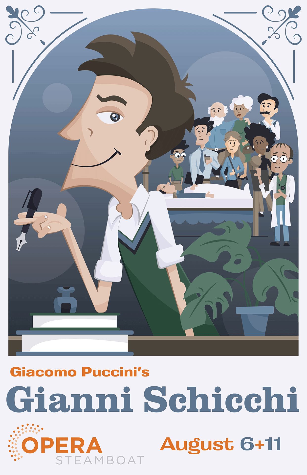
The “Gianni Schicchi” poster masterfully depicts the opera’s central themes of greed and deception. In a palette dominated by cool blues, greens, and whites, the poster showcases the titular character in the foreground, his expression devious and calculating as he clutches a pen – the instrument of his scheme. Behind him, a tableau of family members and a doctor surround a corpse, their faces etched with exaggerated sorrow. This juxtaposition of Schicchi’s cunning against the family’s feigned grief perfectly captures the opera’s satirical tone.
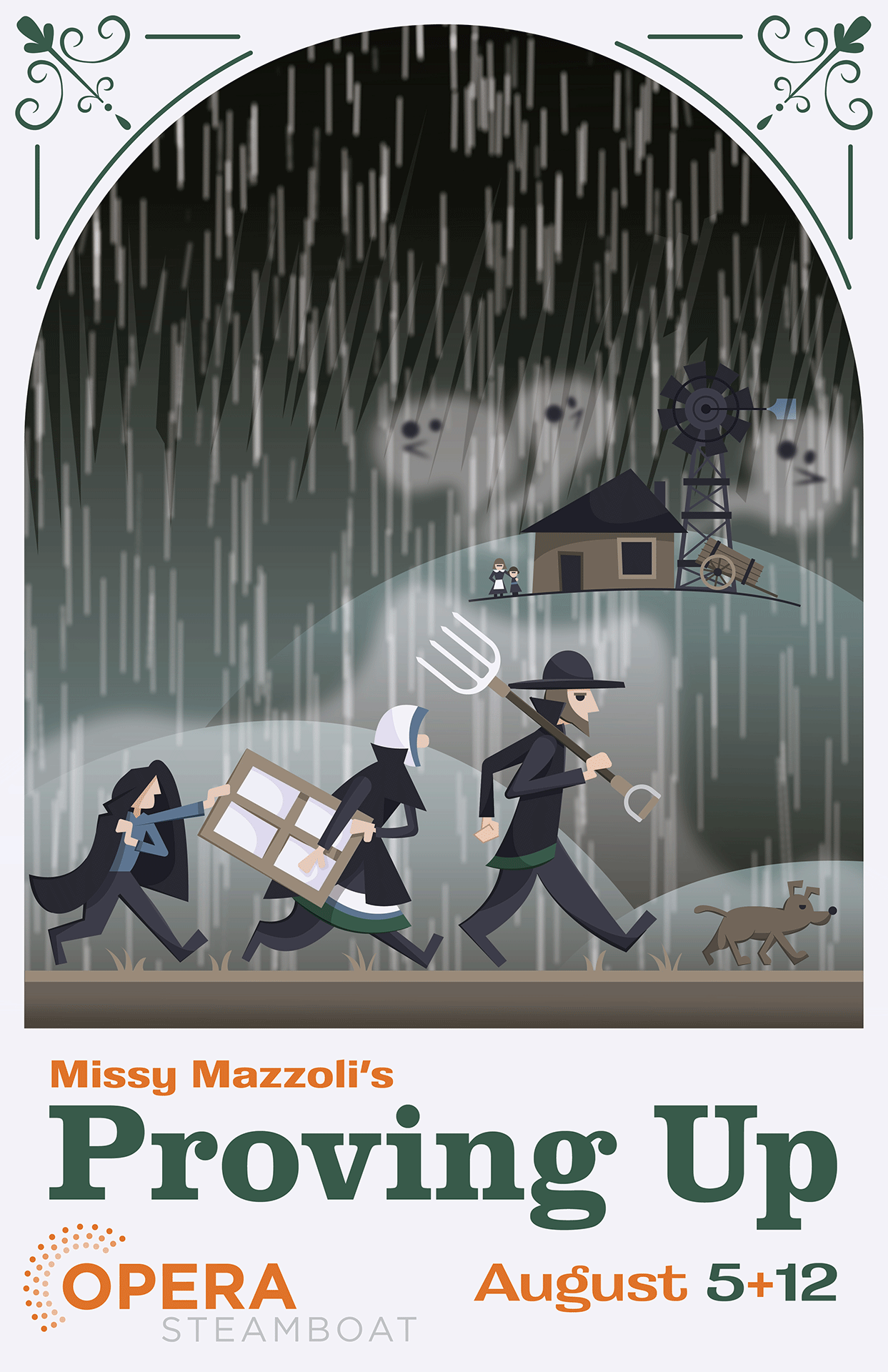
Contrasting sharply is the poster for “Proving Up,” which paints a haunting picture of struggle and perseverance. Set against a vast, unforgiving sky, a family trudges through a torrential rainstorm, clutching a window pane – a symbol of their hopes and dreams. In the background, their lonely cabin perches atop a desolate hill, while ghostly figures lurk in the shadows, hinting at the supernatural elements of the story. The predominant greens, blacks, and browns evoke a sense of the harsh prairie landscape and the daunting challenges faced by frontier families.
Together, these posters not only serve as compelling advertisements for the operas but also as artistic interpretations that draw viewers into the emotional core of each story. They showcase Opera Steamboat’s commitment to presenting diverse, engaging productions that span the range of human experience, from comedic satire to dramatic struggle.
Paired Pawns: An Emblem of Natural Beauty
Client: Hummingbird Hangout
This crest artfully combines natural elements with subtle chess motifs, creating a unique and inviting emblem. At the heart of the design, a pair of stylized hummingbirds take flight, their wings outstretched in a manner reminiscent of a knight’s dynamic movement on a chessboard, symbolizing agility and adaptability.
Surrounding the hummingbirds are flowers and leaves that pay homage to the local flora, echoing the circular pattern of a chessboard’s center and suggesting a sanctuary where strategy and nature converge. Interspersed among these elements are abstract fish accents, nodding to the area’s rich fishing culture and further enhancing the crest’s connection to the natural environment.
The crest’s two-tone color palette features bold red and black, accented with red halftones that mirror the vibrant color of the cabin. This thoughtful design choice ties the emblem seamlessly to its physical counterpart.
Queen Bishop: Concerto Of Branding
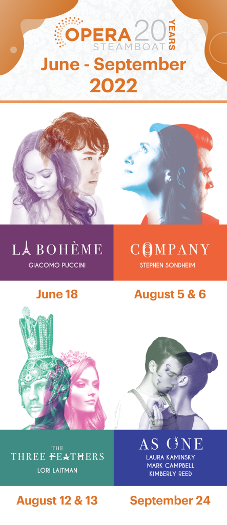
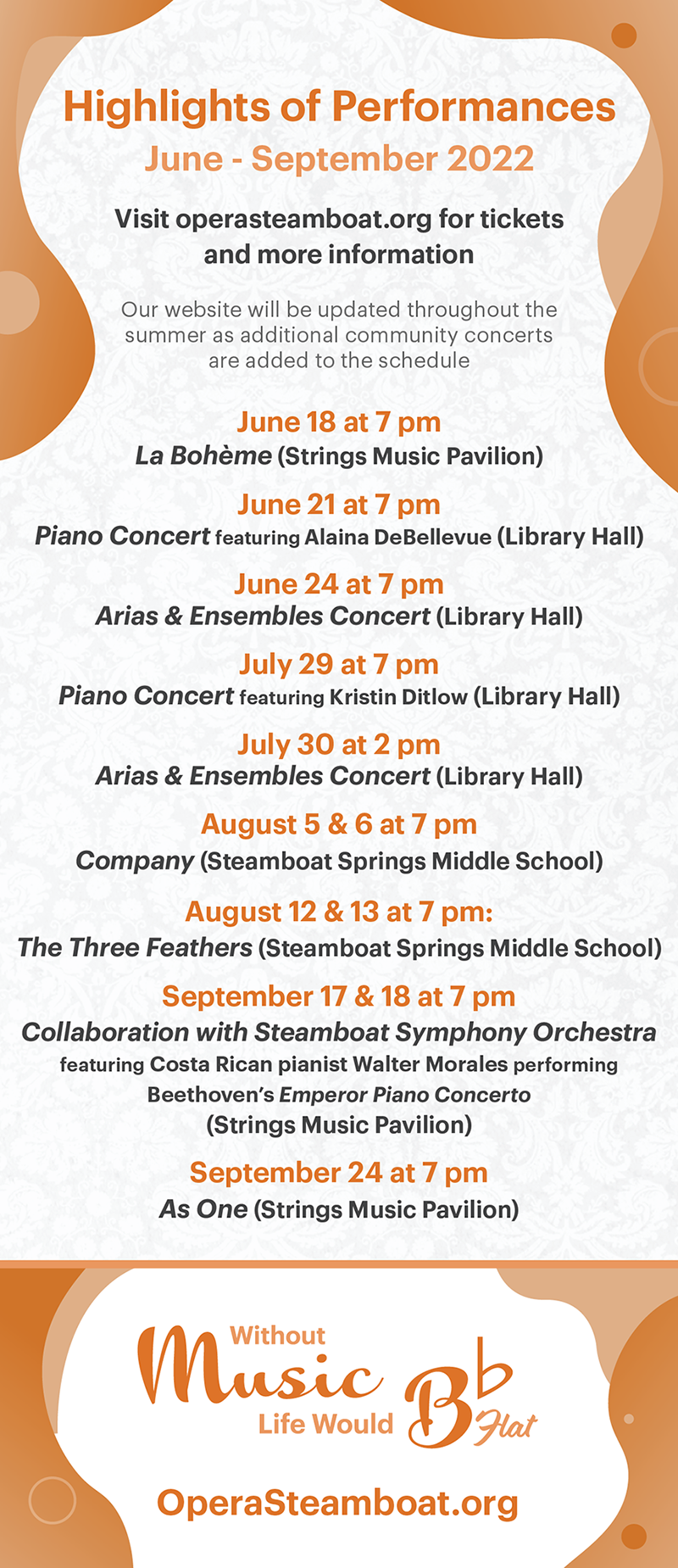
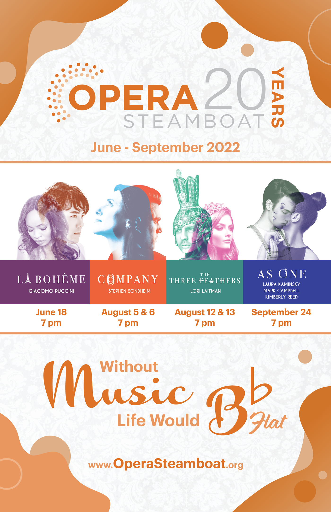
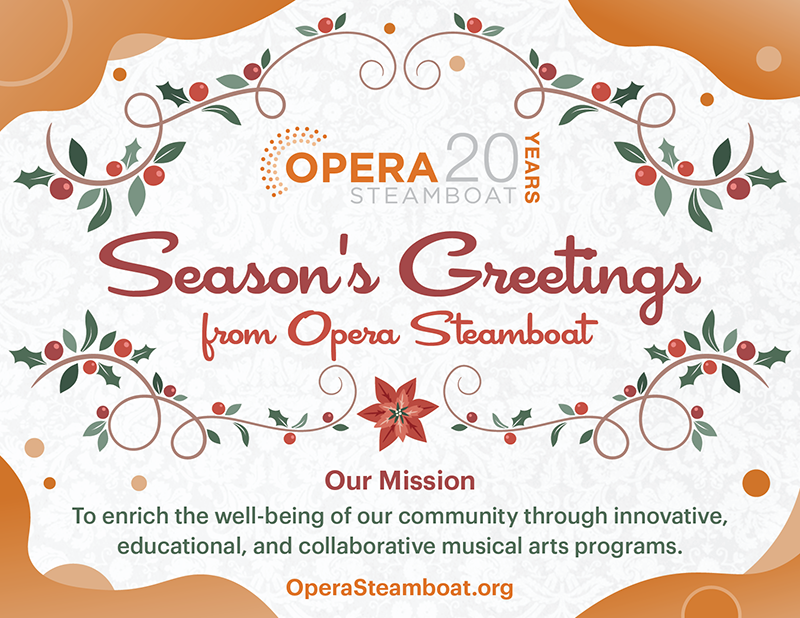
For the 20th anniversary, I crafted a branding strategy that embodies celebration and movement. The design features a striking logo that honors two decades of artistic excellence, surrounded by abstract, wavy forms in the organization’s signature orange.
These dynamic shapes extend throughout all aspects of the branding, creating a sense of flow and energy akin to the strategic maneuvers of chess pieces on a board. The logo acts as the king, while the fluid designs move like bishops and queens, enhancing the visual identity and inviting audiences to engage with the vibrant spirit of the performances.
This cohesive branding serves as a testament to Opera Steamboat’s evolution, promising a future filled with captivating artistic experiences. Like a well-executed gambit, it celebrates the past while setting the stage for the next chapter in its storied history.
